
Site Style Guide
Cover Block, set to full width, with text aligned to bottom center
50% opacity; default Cover Block height = 430 pixels
Typography:
Headings are set in …and body copy is set in … typeface.
Heading 1: xx pixels, bold (800) weight (xx pixels on large desktop monitors; xx pixels on extra large monitors)
Huge font (xx pixels): for short lead-ins (xx pixels on extra large monitors)
Large font (xx pixels): for 1 sentence attention-getting introductions (xx pixels on extra large monitors).
All Headings should be followed by at least 1 sentence of explanatory text.
You can create a non-breaking paragraph (no bottom margin) by holding down the Shift key while pressing Enter/Return.
Below are the “semantic HTML elements” for your website. Check the source code, via the “Text” tab on the right side of the Page Editor, to see embedded elements within paragraphs.
Heading 2: xx pixels, bold (700) weight (xx pixels on large desktop monitors; xx pixels on extra large monitors)
Medium size paragraph xx pixels (xx pixels on extra large monitors): Lorem ipsum dolor sit amet, consectetur adipiscing elit. Morbi in imperdiet mauris, a ullamcorper risus. Aenean scelerisque arcu nec fermentum tempus. Sed ut cursus sem, vitae pellentesque ante.
Lorem ipsum paragraph: 16 pixels (18 pixels on larger desktop monitors) This is bold, or strong, text. Nullam dignissim convallis est. Quisque aliquam. This is emphasized, or italicized text. 53 = 125. Water is H2O. The New York Times (That’s a citation). Underline – do NOT ever do that because underlines are reserved for links only!
Heading 3: xx pixels, bold (700) weight (xx pixels on large desktop monitors; xx pixels on extra large desktop monitors)
Heading 4: xx pixels, bold (700) weight (xx pixels on large desktop monitors)
Small font-size (16 pixels): Lorem ipsum dolor sit amet, consectetur adipiscing elit. Morbi in imperdiet mauris, a ullamcorper risus. Aenean scelerisque arcu nec fermentum tempus. Sed ut cursus sem, vitae pellentesque ante.
Separators (default and wide)
Colors
Web Content Accessibility Guidelines (WCAG) level AA requires a minimum color contrast ratio of 4.5:1 for normal text; and 3:1 for large text (19 pixels and bold; or 24 pixels)
Black: hex #111, rgb(17,17,17) | Color Contrast 18.9:1
Purple: hex #5d4070, rgb(93,64,112) | Color Contrast 8.6:1
Yellow: hex #f6d56e, rgb(246,213,110) | Color Contrast 13.2:1
Tan: hex #caa93e, rgb(202,169,62) | Color Contrast 8.3:1
Light Tan: hex #dacb98, rgb(218,203,152) | Color Contrast 11.7:1
Warm Red: hex #f15e22, rgb(241,94,34) | Color Contrast 5.7:1
Warm Red: hex #f15e22, rgb(241,94,34) | Color Contrast 3.3:1
Must be large size text to meet color contrast guidelines
Alternate Colors
Orange: hex #F09D4D, rgb(240,157,77) | Color Contrast 8.7:1
Blue: hex #009eba, rgb(0,158,186) | Color Contrast 5.9:1
Blue: hex #009eba, rgb(0,158,186) | Color Contrast 3.2:1
Must be large size text to meet color contrast guidelines
Dark Blue: hex #2B769F, rgb(43,118,159) | Color Contrast 5:1
Green: hex #83BD41, rgb(132,189,65) | Color Contrast 8.4:1
Green: hex #83BD41, rgb(132,189,65) | Color Contrast 2.25:1
Fails to meet color contrast guidelines at all sizes
List Types (in a 2-column block)
Ordered List
- List Item 1
- List Item 2
- Nested list item A
- Nested list item B
- List Item 3
Unordered List
- List Item 1
- List Item 2
- Nested list item A
- Nested list item B
- List Item 3
HTML Table
Note: HTML tables should be used only for tabular data – not for layout purposes. Because tables are not optimized for smaller mobile devices, when necessary, use as few columns as possible and keep table cells fluids (i.e. no “fixed widths”)
| Header 1 | Header 2 | Header 3 |
|---|---|---|
| Item 1 | Item 2 | Item 3 |
Blockquote
Hoosier marketer? A CSS superman – faster than a 500 kb page load and able to leap long URLs. He hails from Indiana, the home of General Knight. With his four sidekicking hens, he now guards his Morgan Junction office in West Seattle, Washington.
Scott Marlow
Pullquote
Hoosier marketer? A CSS superman – faster than a 500 kb page load and able to leap long URLs. He hails from Indiana, the home of General Knight. With his four sidekicking hens, he now guards his Morgan Junction office in West Seattle, Washington.
Scott Marlow
Links
Text links are automatically blue, with an underline.
Although PDF documents can open in new windows, to adhere to accessibility and usability guidelines links to other sites and pages should never open in new windows.
Posts vs. Pages
Posts should be used for multi-relational, categorical content, as well as any time-sensitive content. Posts can be used more dynamically throughout the site than pages.
Pages should be used for ‘static‘ content that does not need to be archived.
Latest Post Block, displaying optional Featured Image and Post Excerpt in a 2-column grid
- Hello World!Welcome to WordPress! This is your first post. Edit or delete it to take the first step in your blogging journey.
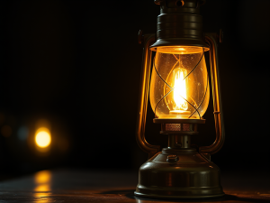
- Banner Lighting
 Kerosene Lamps, …lighting, etc.
Page Attributes: Page Templates
The site layout is mobile responsive, optimized for 1,440 pixel wide displays. The site theme is based on _Underscores – the 1,000 hour head start Theme by Automattic.
- Default Template: This page has a maximum main content width of xxx pixels
- Full Width Template: This page has a maximum main content width of #,### pixels
Appearance: Patterns/Template Parts
Template Parts are used in 1 Theme area: the Footer, for quick links or other calls-to-action.
Only site Administrators can edit Template Parts via Appearance/Patterns, from within the WordPress Dashboard.
Media Library
The Media Library contains all your uploaded images and file documents (PDFs, .DOCs, etc.). Most images should generally be uploaded in standard aspect ratios of 3:2 and 16:9; WordPress creates 3 proportional sizes to insert into Pages/Posts.
- Thumbnail: 150 pixels wide x 150 pixels tall (max)
- Medium: 428 pixels wide x 428 pixels tall (max)
- Large: 1024 pixels wide x 768 pixels tall (max)
- Featured (panorama header) Images, for Cover Blocks and full-width Images: recommend custom crops from 16:9 ratio (standard) to 2:1, but 3:1 to 4:1 can also work, depending on the image subject matter. Taller images, e.g. 16:8 (2:1), often work better for Cover Blocks where the focal point can be selected from a larger area.
1,440 pixels is a moderate width that fits a majority of desktop resolutions; this width generally scales up well for larger monitors without having an undue impact on page load speed. By default, Cover Blocks display panorama images with a height of 430 pixels
1440 pixels x 810 pixels = 16:9 aspect ratio (recommended for Post Featured Images)
1440 pixels x 720 pixels = 2:1 aspect ratio
1440 pixels x 480 pixels = 3:1 aspect ratio
1440 pixels x 360 pixels = 4:1 aspect ratio
Media & Text Block (with optional colors)
Media & Text Block
Default alignment (image on left) with content aligned to top
The Media Library includes a Title and Alt Text associated with each image. The Title may display as a ‘tip’ when a visitor hovers over the image, or as meta information in some image galleries; the Alt Text is what search engines and screen readers ‘see.’
Use semantic naming conventions for both the Title and Alt Text. For example, an appropriate Title might be: headshot: FirstName LastName; and appropriate Alt Text might be: FirstName LastName, headshot. Why list headshot first in the Title? Because that method allows all of your headshots to display in order in the Media Library, under headshot, instead of by name – making them easier to find.
User Roles
- Administrator – somebody who has access to all the administration features within a single site.
- Editor – somebody who can publish and manage posts including the posts of other users.
- Author – somebody who can publish and manage their own posts.
- Contributor – somebody who can write and manage their own posts but cannot publish them.
Dashboard: Updates
Periodically, Automatic (the makers of WordPress) release feature updates. Site Administrators can update WordPress. Some updates includes security patches; these updates are more critical than feature-only updates.
Site Information (effective October 2024)
Domain Registrar: SquareSpace (formerly Google)
Domain Registrant: (anonymous)
Domain expiration: May 7, 2025
Web Host: WP Engine
Email Host: Google WorkSpace
The domain is hosted on an open source web server, running PHP 8.1, that meets WordPress requirements.
Performance Analysis
| Performance Metric | Live (Webflow) website (October 2024) | New WordPress Website (November 2024) |
|---|---|---|
| Google Lighthouse: Accessibility | 88/100 | /100 |
| Google Lighthouse: Best Practices | 82/100 | /100 |
| Google Lighthouse: Mobile Speed | 86/100 | /100 |
| Google Lighthouse: Desktop Speed | 96/100 | /100 |
| Google Lighthouse: Search Engine Optimization | 100/100 | /100 |
| WebPageTest Speed Index | 6.122 | |
| Total Homepage File Size | 5.575 Mb (4.6 Mb Images + 873 Kb Scripts + 171 Kb Fonts + Kb HTML) | kb (Kb Images + Kb Scripts + Kb CSS + Kb Fonts + Kb HTML) |
| Total Web Server Requests | 77 (38 Images + 22 Scripts + 2 CSS + 11 Fonts + 1 Other + 3 HTML) | ( Images + Scripts + CSS + Fonts + HTML) |
| Estimated Mobile Homepage Load Time | ~6.1 seconds | ~ seconds |
In 2023, the average page size = ~2.4 Mb and median page size = ~2.1 Mb.
Database-driven websites, like WordPress, are more performance optimized when server requests are < 40 – 60.
Site Credits
Visual Design: Terri Nakamura
WordPress Theme Development: Scott Marlow
This site is powered by WordPress – an award-winning, open source, semantic Content Management System (CMS) used by over 800 million sites. WordPress powers 2 of every 5 websites.
Help & Support
You can find support at wordpress.org (NOT wordpress.com, the free blog hosting platform). The most recent WordPress for Dummies book is also a good resource.
Developer Notes
- Never underline text that is not a link. Instead use bold or emphasis (italics)
- Use only lower case for all html tags and file names (like images and documents)
- Do NOT open links to other websites in new windows.
- Do NOT double-space after periods, colons, etc. Digital typesetting now handles the spacing after characters. Also, double spaces can create odd characters in HTML.
- All headers and subheaders should contain some text, e.g. like a paragraph. Try not to follow a header directly by a subheader.
- Include alternate text for all images uploaded to the Media Library
- Be cautious of installing third-party Plugins (and Themes), which can contain code conflicts or malicious code that can break your theme design or site functionality. Deactivate and remove all unused Plugins and Themes to help secure your website.
- Admins, Editors and other users should always use secure passwords:
14-character, alpha-numeric passwords with at least one uppercase letter and one special character are most secure.
Note: You may notice minor layout discrepancies between operating systems (PCs and MACs) and various browsers (e.g. Chrome, Firefox, Internet Explorer, Opera, Safari, etc.). This is due to how browsers render HTML and CSS; not all browsers, particularly older ones, conform to W3C specifications.